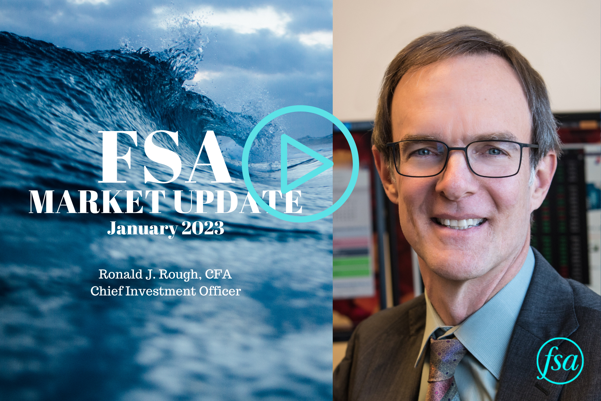
Ron Rough, Chief Investment Officer, presents our January video market update and shares how FSA is responding.
January Stock Market Update Transcript
Hello, this is Ron Rough with the market update video for January 2023. Probably no need to report how terrible of a year it was for investors – stock market indices down 15% to 30% in some cases; bond indices down over 10%; worst year on record for high quality bonds, so just an eventful year, all in the negative side. The only area of the market that was really a port in the storm were commodities, and that was basically due to the strength in oil and natural gas, and then, secondarily, T-bills, which rates started going higher, so you can actually earn a yield now on money markets, T-bills. So, those were really the only areas that offered any protection for investors last year.
Of course, now at this point, the question becomes, what next? The chart I have for you here is the S&P 500. The purple chart is the 200-day moving average. The green line is the 50-day moving average. And you can see I’ve got two red lines horizontally which are marking the area of resistance that we’ve been in for the past eight months. The market’s been in this trading range, broke above it a little bit in the summer, broke below it a little bit in the fall, but we’ve been in this range. And for our process to start getting back invested, we want to see the market break above that purple line, the 200-day moving average, and ultimately break above the upper band of that resistance. You can see at this point, it’s still a negative market environment, even though the market has started off this year on a pretty good rally, which is good. It’s encouraging. It gives us some thought that maybe things will improve, but there’s still some work to do, and there’s a lot of unknowns out there that the market has to deal with, so who knows what we’ll see as the year unfolds.
What does this mean for the FSA portfolios? On the left side of this chart, I’ve got our core equity portfolio pie chart, pie chart for the conservative growth, and also income and growth, and how we were invested at the end of the third quarter. You can see, primarily all in cash; in some cases we had inverse funds in there. We had small equity positions and conservative growth and income and growth, and those were, there was a market neutral fund and a merger arbitrage fund, so very defensive funds, really very defensive across all three of these strategies. And now, I want you to see where we are today. And you can see across all the strategies, we have started moving the portfolios back into the markets, bond or stock markets.
Core equity, you see, it’s now 50% invested. Conservative growth is 30% invested with 10% in high yield bonds. Income and growth is 20% invested in equities and another 40% invested in bonds. So, we’re not fully invested by any means, and a number of the positions are fairly conservative, but we have moved off the beach and back into the water. And so, what we’re going to be looking for, if you think back to the prior chart, if we can break above that resistance area, break above the 200-day movement average, that’ll start giving us the green light to take the portfolios even more invested. We’ll see, if that’s the right move to make; time will tell.
One of the things that people are always curious about as we come into a new year is, what’s the forecast? What’s the outlook for the new year? And interestingly, forecasts are all over the map. If I were to generalize the sense I’ve gotten from most observers of the market, most people feel that we should expect a difficult first half of the year and a positive environment at the end of the year as the market struggles with do we go into a mild recession and what’s inflation doing?
But I offer to you, finally, this chart. This is from Ned Davis Research. They do some really great analysis, and every year they do for fun kind of a fun forecast for the year. They look at a couple of different historical patterns, and then they roll all that together to come up with this one forecast. And so, what you can see is, according to this particular analysis, we should expect a positive first half of the year and then much more choppiness and difficulty in the second half of the year. So, I leave that with you to take it with a grain of salt, but it’s interesting, at odds with a number of the forecasts that are out there on the street today. And obviously, we’re not going to invest based on a forecast; we invest based on reaction to the current market. So, for now, the market is telling us we see enough positives to pull us off of the beach, back into the shallow end of the water, and continued improvement in the markets will actually get us all the way back in. But, that’s what we watch day to day to see what happens.
That’s all I have for today. Until our next update, thank you for watching.
FSA’s current written Disclosure Brochure and Privacy Notice discussing our current advisory services and fees is available at www.FSAinvest.com/disclosures or by calling 301-949-7300.


